From Profitability to Isoprofit Diagrams in Excel
5
Sections
1
Video
All
Skill Level
0:15h
Duration
English
Language
Share This Info:
Overview
In the intricate world of business, understanding the financial underpinnings that signal a company’s health and potential for growth is paramount. Amidst various analytical tools and models, the journey from grasping basic profitability to mastering the nuanced insights of the DuPont model and Isoprofit diagrams represents a critical path for finance professionals and business leaders alike. This page embarks on a comprehensive exploration of these concepts, providing a clear, step-by-step guide to not only understanding but also applying these financial analyses using Excel. Whether you’re a seasoned CFO, a budding entrepreneur, or a finance student eager to deepen your analytical skills, the insights offered here promise to illuminate the path to financial acumen and strategic decision-making. Through this journey, we’ll unlock the secrets of effectively using assets to generate sales, maximizing profit margins, and ultimately, enhancing shareholder value. Join us as we delve into the world of financial analysis, transforming complex data into actionable business strategies.
Learning Path
In the business world, profitability signifies a company’s ability to generate earnings compared to its expenses over a specific period. It’s not just about making money; it’s about how efficiently a company can convert its operations into profits. This efficiency is crucial because it reflects the company’s sustainability, growth potential, and ability to attract investors. Profitability is the heart of any business’s financial health, guiding strategic decisions, investments, and stakeholders’ confidence.
Basic Profitability Ratios
Profitability ratios are vital tools in assessing a company’s financial performance. Here’s a brief overview of the basic ones:
- Gross Profit Margin: This ratio shows the proportion of money left over from revenues after accounting for the cost of goods sold (COGS). It’s a fundamental indicator of the company’s production efficiency and pricing strategy.
- Operating Profit Margin: Also known as operating margin, this ratio reflects the percentage of revenue that remains after covering operating expenses. It highlights how well the company manages its operational costs and is crucial for evaluating the efficiency of business operations.
- Net Profit Margin: This ratio measures what percentage of revenue translates into profits after all expenses have been deducted, including taxes and interest. It’s arguably the most telling indicator of a company’s overall financial health, showing how effectively it can convert revenue into net earnings.
These ratios provide a layered understanding of profitability, each focusing on different aspects of financial performance. By tracking these metrics, businesses can pinpoint areas needing improvement, whether in cost management, pricing strategies, or overall operational efficiency.
History and Overview
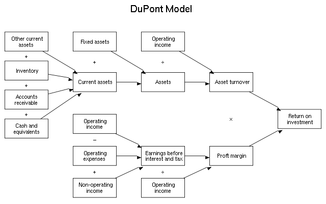
The DuPont model, developed by the DuPont Corporation in the early 20th century, represents a revolutionary approach to financial analysis. Its development aimed to provide a comprehensive view of a company’s financial health beyond simple profit margins. By dissecting financial performance into multiple components, the DuPont model offers insights into how effectively a company uses its resources to generate profit. This framework not only helps businesses assess their financial stability but also guides strategic decision-making to improve overall performance.

Image Source: Wikipedia
Components Explained
The DuPont model offers a detailed method to analyze a company’s Return on Equity (ROE) by decomposing it into three major components that reflect operational efficiency, asset management, and financial leverage:
Net Profit Margin: This component measures how much profit a company makes for each dollar of revenue, indicating the efficiency of turning sales into profit. It’s calculated by dividing net income by revenue. A higher net profit margin indicates a more profitable company that keeps more per dollar of sales.
Asset Turnover: This measures the efficiency with which a company uses its assets to generate sales, calculated by dividing sales by average total assets. A higher asset turnover suggests that the company is using its assets more effectively to generate revenue.
Equity Multiplier: Reflecting a company’s financial leverage, the equity multiplier is calculated by dividing total assets by total shareholders’ equity. It shows how much of the company’s assets are financed by shareholders’ equity versus borrowed funds. This ratio indicates how a company’s reliance on debt amplifies the ROE.
Calculations
To calculate ROE using the DuPont model, these components are multiplied, incorporating the effect of ROA initially:
- ROA (Return on Assets) = Net Profit Margin x Asset Turnover
- ROE (Return on Equity) = ROA x Equity Multiplier
For example, if a company has:
- A net profit margin of 5% (0.05)
- An asset turnover of 2
- An equity multiplier of 1.5
The calculations would be:
- ROA = 0.05 x 2 = 0.10 or 10%
- ROE = 0.10 x 1.5 = 0.15 or 15%
This indicates that the company generates a 15% return on its equity, primarily driven by its ability to convert sales into profits efficiently, use its assets effectively, and leverage its financial structure.
The DuPont model is a powerful tool because it doesn’t just provide a snapshot of the company’s financial health; it dissects the contributing factors, giving stakeholders a clearer view of where improvements can be made or strengths can be leveraged. This comprehensive approach allows for targeted strategies to enhance profitability, asset utilization, and efficient financial management.
From DuPont to Isoprofit
Building on the foundational insights of the DuPont model, Isoprofit diagrams offer a more nuanced perspective on profitability and efficiency. While the DuPont model dissects return on equity into three key components, Isoprofit diagrams take this analysis further by visually mapping the interplay between these elements and their impact on a company’s financial performance. This visual representation allows for a deeper understanding of how changes in operational efficiency, asset management, and financial leverage can influence overall profitability.
Defining Isoprofit Diagrams
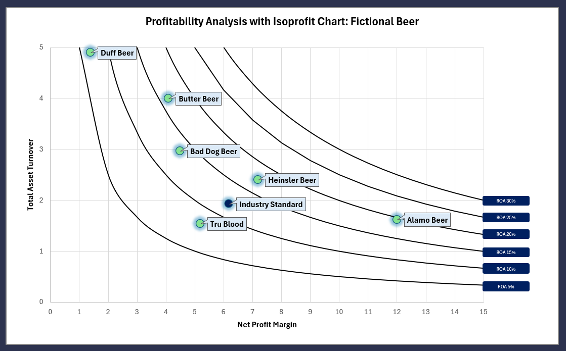
Isoprofit diagrams serve as a graphical tool for visualizing the profitability analysis. They are designed to help managers and analysts see beyond the numbers, providing a visual representation of a company’s financial dynamics. Through these diagrams, one can easily identify areas of strength and pinpoint where improvements are needed, making them an invaluable tool for strategic planning.
The essence of Isoprofit diagrams lies in their ability to depict the relationship between different financial metrics in a way that is intuitive and easy to understand. By charting variables like net profit margin, asset turnover, and equity multiplier against each other, these diagrams highlight the balance (or imbalance) between various aspects of financial health. For instance, a company might have a high net profit margin but low asset turnover, suggesting efficient cost control but poor asset utilization.

In practice, Isoprofit diagrams are utilized to:
- Spot Trends: Quickly identify trends over time in each of the DuPont model’s components.
- Benchmarking: Compare a company’s performance against its competitors or industry standards.
- Strategic Decision Making: Inform strategic decisions by visually highlighting how different strategies might impact the financial performance.
By transforming abstract numbers into a coherent visual story, Isoprofit diagrams make it easier for decision-makers to grasp complex financial relationships at a glance. This enhanced understanding facilitates better strategic planning and more informed decision-making, ultimately guiding companies towards improved profitability and efficiency.
Here’s how to create an iso-profitability diagram in Excel, step by step:
Preparation:
To start, gather the necessary data:
- Net Profit Margin (NPM): Formula = Net Profit / Sales
- Asset Turnover (AT): Formula = Sales / Total Assets
- Equity Multiplier (EM): Formula = Total Assets / Total Equity
You will also need Excel or a similar spreadsheet tool capable of plotting scatter plots.
Step-by-Step Guide:
- Input Data: In Excel, input your collected data in columns, including sales, net profit, total assets, and total equity.
- Calculate Metrics: Next to your data, calculate the NPM, AT, and EM using the formulas provided above.
- Prepare the Diagram:
- Choose a scatter plot from Excel’s chart options.
- Plot the Asset Turnover on the X-axis and the Net Profit Margin on the Y-axis. Use the Equity Multiplier to adjust the size of the dots or as a third axis if your tool allows.
- Customize Your Chart: Label each axis appropriately, and add a title to your chart for clarity. You may also color-code data points based on different periods or product lines for better comparison.
Interpreting the Diagram:
- High NPM & High AT: Indicates efficient asset use and profitability. Aim for strategies that maintain or enhance both metrics.
- Low NPM & High AT: Suggests good asset utilization but low profitability per sale. Focus might be on improving cost management or pricing strategies.
- High NPM & Low AT: Reflects high profitability per sale but poor asset utilization. Strategies may involve better asset management or expansion to new markets.
Isoprofit diagrams offer a clear visual of where a company stands regarding profitability and asset utilization, guiding strategic decisions to improve financial performance.
This is a streamlined guide and assumes proficiency with Excel. Having prior experience can make the process smoother.
Further down you will find a video that explains how to make the diagram.
Case Studies:
- Manufacturing Efficiency: A manufacturing company struggling with profitability used Isoprofit diagrams to analyze their operations. They discovered that a slight increase in asset turnover by optimizing their production process could significantly boost their return on assets. This insight led them to invest in automation technologies, resulting in a noticeable improvement in both efficiency and profitability.
- Retail Chain Expansion: A retail chain used Isoprofit diagrams to assess the impact of opening new stores on their overall profitability. The diagrams highlighted that while new stores would increase asset turnover, the net profit margin would potentially decrease due to initial high costs. This analysis prompted the company to implement a phased expansion plan, focusing first on areas with higher demand to maintain profitability.
Tips for Effective Use:
- Regular Reviews: Integrate Isoprofit diagram analysis into your quarterly business review processes. This allows for timely adjustments to strategies based on the latest financial performance insights.
- Cross-Departmental Collaboration: Encourage collaboration between finance, sales, and marketing teams in the creation and interpretation of Isoprofit diagrams. Different perspectives can yield more comprehensive strategies for improving profitability.
- Dynamic Modeling: Use Isoprofit diagrams not just for current state analysis but also for modeling future scenarios. This can be particularly useful for strategic planning, investment decisions, and risk management.
- Educate Your Team: Ensure that key stakeholders across the company understand how to read and interpret Isoprofit diagrams. Consider holding training sessions or workshops to promote a culture of data-driven decision-making.
By applying these practical applications and tips, businesses can leverage Isoprofit diagrams as a powerful tool for strategic decision-making, helping to navigate the complexities of profitability and asset utilization with greater clarity and confidence
Conclusion
In this comprehensive exploration, we’ve unlocked the intricacies of financial performance analysis, from the fundamentals of profitability through the strategic depths of the DuPont model, culminating in the innovative application of ISOp diagrams. Each step of this journey equips businesses with sharper tools for dissecting their financial health, enhancing decision-making processes with precision and insight.
Key Takeaways:
- Profitability Is Fundamental: Understanding and applying basic profitability ratios lays the groundwork for deeper financial analysis.
- The DuPont Model Deepens Insight: By breaking down Return on Equity into three key components, the DuPont model offers a more detailed perspective on a company’s operational efficiency.
- Isoprofit Diagrams Offer Nuanced Views: Transitioning to ISOp diagrams enables businesses to visualize complex financial relationships, making strategic insights more accessible.
- Practical Application Drives Strategy: Real-world applications and case studies illustrate how these analyses inform strategic business decisions, from efficiency improvements to expansion strategies.
We encourage businesses to not just appreciate the theoretical value of these tools but to actively integrate them into their financial analysis and strategic planning efforts. Embracing these techniques can unveil new layers of insight, drive informed decision-making, and ultimately, steer companies toward greater financial health and competitive advantage. Apply these tools and techniques in your own financial analysis to unlock potential and propel your business forward.
